

Sister Branding
warm | cosy | LOVING | earthy
I’ve curated some Sister fonts and colour palettes so that you just plug-n-play your website’s branding!
Step 1: Choose an Expressive Font (Headings)
Step 2: Choose a Neutral Font (Paragraphs)
Step 3: Choose a Colour Palette
Don’t worry if you’re not sure! You can test out different fonts and colours on your website - we’ll do that together in Module 2.

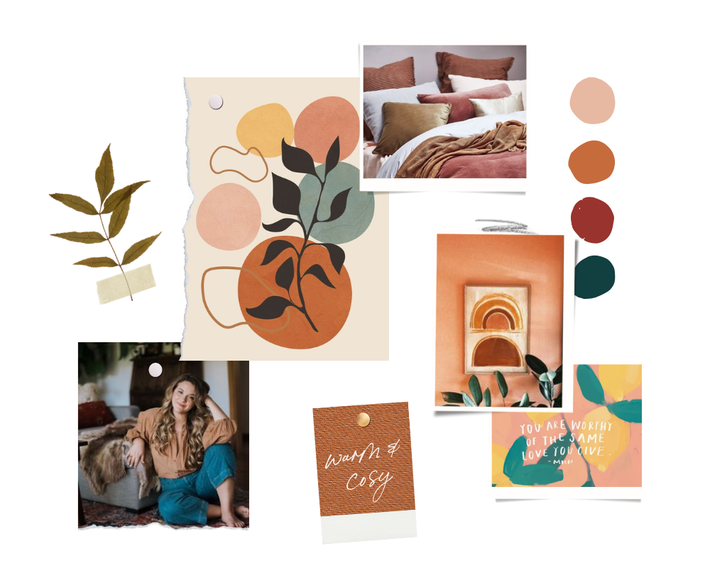
(free) sISTER
Expressive Fonts
Here are some round and friendly Sister fonts for your website’s Headings. These are available in Squarespace & Canva.
01


(paid) sister
Expressive Fonts
Here are some round and friendly fonts for your website’s Headings. These are available for purchase in Creative Market. I will show you how to install them into Squarespace in Module 2.


(FREE) sans serif
Neutral Fonts
Here are some neutral fonts for your website’s Paragraphs. These fonts pair
well with most Expressive Fonts, and are available in Squarespace & Canva.
Sans serif fonts tend to feel cleaner and more modern. You’ll see that some feel rounder and softer, some feel bolder and sharper.
02


(FREE) serif
Neutral Fonts
Here are some neutral fonts for your website’s Paragraphs. These fonts pair
well with most Expressive Fonts, and are available in Squarespace & Canva.
Serif fonts tend to feel more classic and elegant. You’ll see that some feel rounder and softer, some feel bolder and sharper.


sister
Colour Palettes
Here are some sample Sage palettes - they tend to be clean and neutral. Don’t worry if you’re not sure about your palette yet; I’ll be showing you other ways to curate your website’s colour in Module 2 (e.g. from a single colour, image, or Pinterest palette).
03
#deded4
#cdc6ad
#a49f86
#495641
#cfd0c8
#f5f5f5
#b6aba1
#d0c7be
#8e806f
#555250
#ececec
#9fb3af
#d7dAd9
#447274
#222f2e
#e5e0db
#d7b8ac
#d8cdc5
#84857a
#484c33
sister
Imagery & Inspiration
If you want to venture beyond this guide for visual inspiration, check out my Sage Brand Mood Board in Pinterest.
While Pinterest is great for inspiration, for images that you can actually use on your website, head to free libraries like Unsplash, Canva and Pexels. I’ve curated a Sage image library on Unsplash for you.
04


-
That makes total sense! In fact, my whole Brand Spirit framework is based on the premise that we each are a blend of at least 2 Brand Spirits. It is this blend that captures our depth and dualities, and allows for a beautiful range of unique expression within this simple framework. When I work with people 1:1, I am quite deliberate in how I integrate the energy of their Brand Spirits to create a unique visual expression for them.
Of course, the simplest way to DIY your visual branding is to focus on the Brand Spirit you resonate with the most visually. However, you can easily bring in an element of another Brand Spirit, e.g. a clean Sage brand with an expressive Poet font, a polished Queen brand with a Rebel accent colour, etc.
Also, the creatives that made these fonts, colours and images obviously didn’t do so with my Brand Spirits framework in mind! And so things aren’t clear-cut - there are Sprite fonts that could also work as Sister fonts, Sage colours that could also work as Poet colours, etc.
-
Disclaimer: This is not a scientifically-verified, double-blind, peer-reviewed quiz! It is just a fun and easy jumping off point for your brand visuals.
If you resonate with you Brand Spirits quiz results, it can be very comforting and clarifying to have a visual language to work with. If you don’t, just go with whichever Brand Spirit resonates with you the most, or simply use your 3 Brand Words to create your very own mood board!
-
While we can’t use Pinterest images for our brand and website, it can be a great way to source colour palettes, gather inspiration, and/or collaborate with a brand photographer. Here’s how you can create a Brand Mood Board:
Head to Pinterest and start a new board. You can call is ‘Brand Board’, and if you click on the 3 dots beside the the name, you can add your 3 Brand Words to the description to help you stay anchored.
Use the Brand Spirit Mood Board(s) as a starting point. Hover over any image (Pin) that you like, and click on the red ‘Save’ button (check the drop down menu beside it to make sure it’s saving to your Brand Board). Remember, it’s OK if you relate to certain aspects of a Brand Spirit, and not others. Just take what resonates, and leave what doesn’t.
Add more inspiration to your Brand Board. Pinterest will start suggesting ideas for you at the bottom of your Board. You can also use the search icon at the top to find more inspiration (make sure it’s set to search ‘All Pins’!) Add adjectives that describe your brand before each search phrase, e.g. ‘soulful brand photography’, ‘earthy colour palettes’, ‘minimalist mood boards’, ‘stylish branding’, ‘playful fonts’, etc.
-
When it comes to brand fonts, I generally pair an Expressive Font (for headlines), with a Neutral Font (for paragraphs). Squarespace has plenty of great fonts, but if you want a more distinct Expressive Font for your brand, Creative Market is a great place to source them. This is a ‘deep’ (advanced) option as it requires purchasing and installing the font in Squarepace - I will show you how to install custom font in Module 2.
-
While Pinterest is great for gathering inspiration, for imagery that we can actually use on our websites, Unsplash and Canva are my favourite libraries for beautiful, mostly free, un-’stocky’ images. Here’s a video walking you through my process of curating images in Canva and Unsplash.
Benefits of curating an image library:
Saves time: Rather than starting a new search every time you need an image, it’s much more time-efficient to bulk search for on-brand images. You then have a ready-to-go library of cohesive images you can use for your website, newsletters, social media, etc. For Canva, add your images to a Folder. For Unsplash, add them to a Collection.
Brand cohesion: By curating an image library, you can more easily see if your images sit together cohesively. On a subconscious level, visual cohesion communicates congruence, which cultivates safety and trust. This is particularly important when you’re a coach or therapist!
Search Tips:
Energetics: Rather than just searching literally, try searching energetically. Look for images that have the right mood and energy, and that collectively share a similar style, palette, tone, etc.
Authenticity: Tasteful editing can be really powerful when it comes to creating a vibe, but avoid images that are overly manipulated or posey - if the viewer doesn’t believe the emotion or authenticity of the image, it impacts how much they trust you too.
Shortcuts: When you find an image you really like, use ‘hacks’ like clicking on the photographer name, ‘magic recommendations’, ‘similar images’ or the collection itself to quickly find more images like it.
Q&A
