I believe good web design is, ultimately, empathetic design.
It’s about attuning to the visual and emotional experience of the reader. It’s about holding space in a way that’s kind to the nervous system and deepens connection.
As a depth worker, empathy, attunement and space-holding are of course some of your core superpowers! But when it comes to your website, maybe things feel elusive and frustrating. Maybe after endless tinkering you still can’t figure out why things look or feel off to you. Well, I hope this post will help demystify ‘good web design’, so that you have a website that holds space as thoughtfully as you do.
the 3 pillars of web design
When it comes to creating websites, there are 3 pillars that I consider:
Visual Intelligence
Emotional Intelligence
Strategic Intelligence
A good-looking website isn't necessarily an effective website. And a strategically sound website doesn't necessarily support emotional connection. The magic happens when visuals, emotion, and strategy work together. While this guide focuses on visual intelligence, the principles inevitably work on all 3 levels.
Think about how this works in physical spaces - be it a cafe, a home, or a therapeutic space. How things look (visual) impacts how we feel (emotional), which impacts how we engage (strategic). This is particularly important when it comes to your website, because online overwhelm is real! Creating a space that feels good is a powerful way to cut through the noise, create connection, and ultimately, grow your business!
‘SPACES’: The 6 Principles of Visually Intelligent Design
I use the acronym SPACES for the 6 principles of visually intelligent design:
S — Spacing (does your site feel cramped or spacious?)
P — Portioning (is your site overwhelming or digestible?)
A — Alignment (is there a sense of visual harmony or chaos?)
C — Clarity (are you being clear or confusing?)
E — Energetics (is the energy of your site coherent or incoherent?)
S — Scrollability (are you creating connection - in a matter of scrolls?)
Since we’re talking about visual intelligence, here’s a video walking you through these 6 principles! If you prefer to read, just keep scrolling…
This video is from my Website Template Guide - click to explore!
principle #1
Spacing
Does your site feel cramped and cluttered? Or calm and spacious?
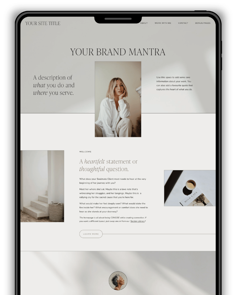
As with physical spaces, a cramped or cluttered space feels overwhelming; a clean and spacious space feels calming. In website terms, that means giving enough breathing room around your sections and elements.
Often, the biggest giveaway of a DIY site is the lack of spacing. My theory is that people tend to apply Word doc habits to websites, where everything is flush to the margins. But the more saturated online content becomes, the less capacity we have, and so creating visual breath in our website helps our nervous systems settle.
There is of course a balance to be had - alot of unnecessary dead space doesn’t serve the visual experience either! But just enough spaciousness really can go a long way.
principle #2
portioning
Is your site overwhelming? Or is it digestible?

Another Word doc habit to avoid is ‘walls of words’! Because when we’re visually overwhelmed, we bounce. Portioning is about chunking our website content into visually digestible portions for a more calm and comfortable experience.
Portioning can look like:
Dividing a page into distinct sections
Pairing text with imagery
Using narrower text columns (reading small font across a full screen is very tiring)
Creating overviews of your services or processes
Breaking your work into phases or components
Creating visual summaries of what's included
Using cards or modules to organise information
principle #3
ALignment
Are you creating visual harmony? Or visual chaos?

Visual alignment is also wonderfully calming for the nervous system! As this is such an integral part of good design, Squarespace uses a grid system, with visual guides that appear to make it really easy to create alignment between elements.
And so, when I’m working with website words, I’m thinking as much about their visual layout as I am about their emotional resonance. I have definitely been known to get over-zealous about the precision of line counts and the symmetry of elements! But that’s because I really do believe that visual harmony has an impact on how good a website feels to be in. You may have the world’s best words in a Google Doc, but without translating them into visually intelligent copy, we risk losing our readers.
principle #4
clarity
Are you creating clarity? Or confusion?

. My Light Template
Clarity might seem obvious, but it's amazing how often websites leave us wondering:
Where is the person based? What does this person actually do? Where am I supposed to go? What's included? How does this work? How much does it cost? What happens next?
Confusion creates friction. And just like visual clutter can be overwhelming, uncertainty can be overwhelming too. As Brené Brown says, clear is kind =). This doesn’t mean we should strip our website words of soul and personality. It’s about balancing connection with clarity, especially in strategic places. For example:
placing essential info in page headers and site footer
having clean and clear navigations (clear beats clever!)
having clear call to actions / buttons (no dead ends!)
marking pages and sections with clear and compelling headlines
being transparent about pricing
including FAQs to address concerns and questions, etc.
principle #5
energetics
Are you creating coherence? or incoherence?

. My Warm Template
This is about the ‘felt sense’ of your site. A website’s energetics can of course be expressed verbally - through your tone of your voice and the choice of words; but also visually - through the colours, textures, fonts, and imagery that you use.
They say an image speaks a thousand words. I believe this is true of visuals in general. This is why branding for me isn’t about pretty packaging. It’s about being intentional about the frequency and coherence we’re transmitting through our visuals. If you’re struggling with this, my Brand Spirits Quiz will help you translate your essence into visual form, and my Website Templates will give you 3 distinct vibes to create from!
principle #6
scrollability
are you creating connection - in a matter of scrolls?

The reality is that we have become a scrolling culture, and when it comes to websites, we tend to scroll before we (decide if we want to) read. And so, my ultimate litmus test for websites is how scrollable it is - ‘if someone were to just scroll your website, would they feel enough of a connection to go deeper?’
In fact, I see scrollability as the golden principle that ‘good design’ is based on:
Portioning our website into digestible sections makes our site more scrollable.
Marking pages and sections with compelling headlines and clear call to actions makes our site more scrollable.
Creating visual breath and harmony makes our site more scrollable.
Being intentional about the energetics of our website - and the instant, intuitive connection they can create - makes our site more scrollable.
So there we have it! The 6 principles of a visually intelligent / empathetic / nervous system friendly website! I hope this gives you some actionable ways to tweak your website so that it looks better, feels better, and works better for your business! And if you’d like to see these principles in action, here’s the video again: